Categories
Uncategorized

The Japanese Tea Ceremony Pottery

I wanted to focus this blog on a form of art that had an emphasis on cultural values and I think that the Japanese tea ceremonies reflect well on this. This ceremony is still an important part of Japanese culture and it is a tradition that goes back to the sixteenth century. A common element in the pottery created is Wabi, which is finding beauty in imperfection and it is seen in many of the pieces used for this ceremony.

Water Jar (Mizusashi) with Pine Trees ca. 1720 Attributed to Ogata Kenzan, Japan

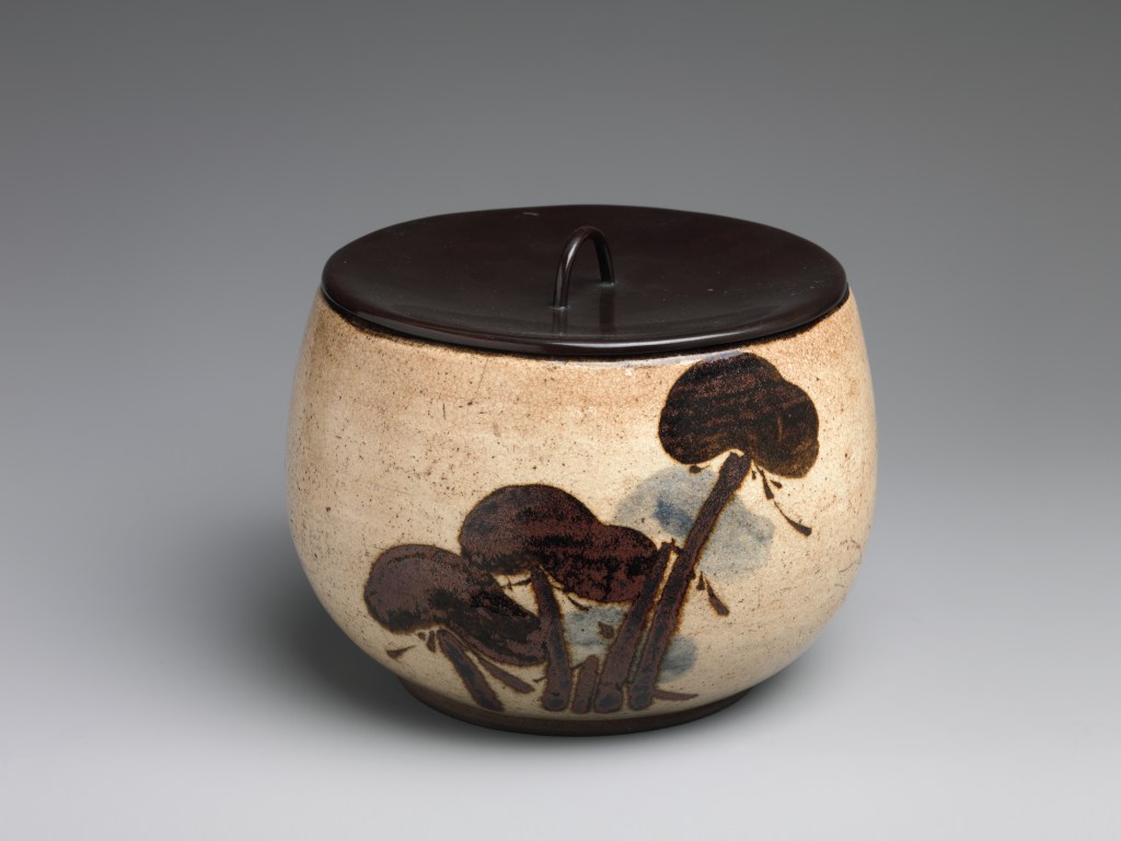
This jar would be used to hold fresh water for rinsing the tea cups and for refilling the kettle. The jar has a white background with a lid that has a black glaze, creating a really nice contrast. There are pine trees featured on the pot painted a with a black glaze. I really like this piece and I think that the contrasting elements are really beautiful and I would definitely want to use this piece in a ceremony. I think that the trees are a really nice peaceful element that brings nature into the core of this piece. Very fitting for a peaceful ceremony.

Clog-Shaped Tea Bowl (Chawan) with Plum Blossoms and Geometric Patterns, early 17th century, Japan

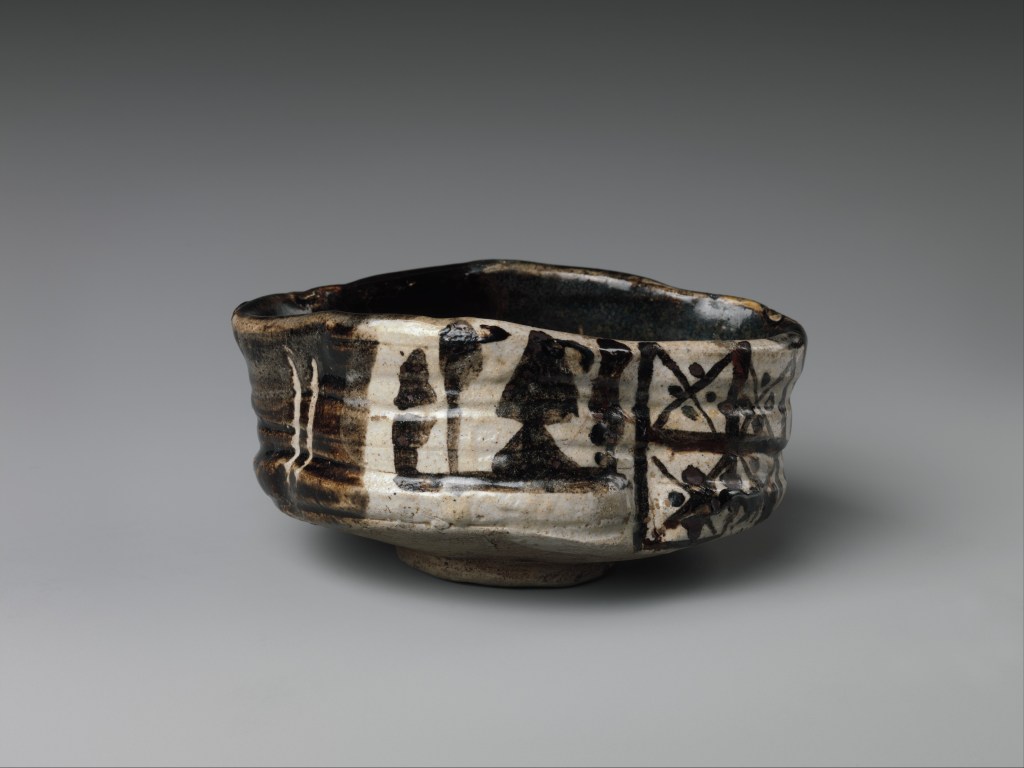
This is a tea bowl which is used to mix the matcha powder used in the ceremony. This bowl really shows off the Wabi style. This bowl looks like it was made out of coiled clay but, it was likely thrown on the wheel and then intentionally dented and made imperfect. I think that the organic nature of this bowl is what makes it so attractive. The form of the bowl being paired with the beautiful design really makes it a gorgeous piece and I would also love to see this being used in a ceremony.

Tea Caddy, named Tall (Seitaka), second half of the 17th century, Nonomura Ninsei,  Japanese

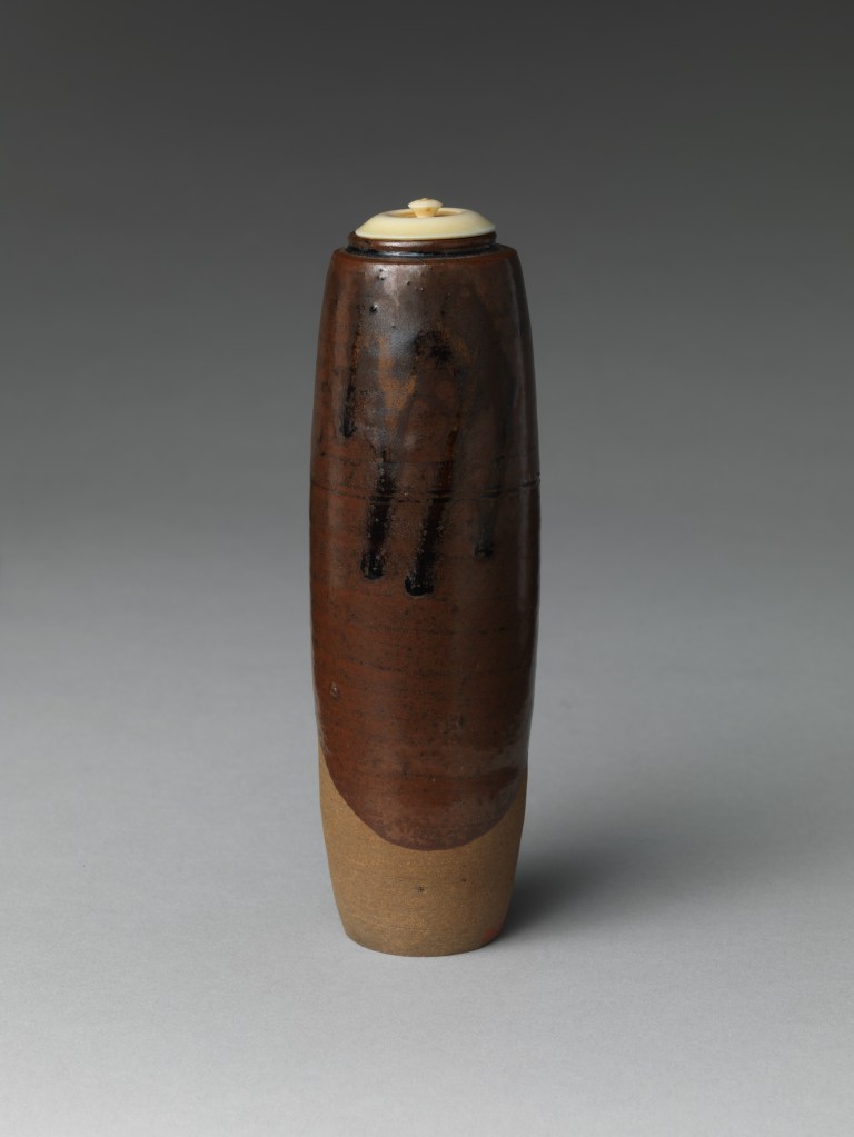
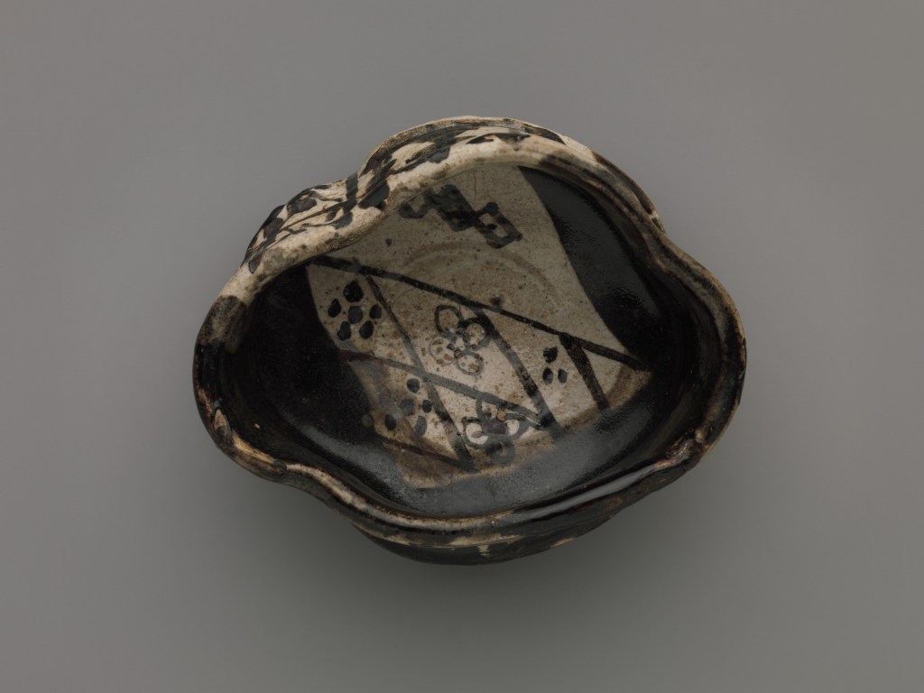
This is a tea caddy that was used to hold the matcha powder used in the tea ceremonies. This particular one was created by Nonomura Ninsei who was a prominent ceramics artist is the 17th century. He was known for merging the old traditional techniques with high heat firing. He is also regarded as the father of kyo-yaki and is well know for his colorful designs. I think this work is really beautiful and I love the contrast between the lid and the rest of the jar. As with the other pieces I would love to see this piece in use.

Citations

Metmuseum.org, http://www.metmuseum.org/toah/hd/jtea/hd_jtea.htm.

Metmuseum.org, http://www.metmuseum.org/art/collection/search/53832.

Metmuseum.org, http://www.metmuseum.org/art/collection/search/52514.

Metmuseum.org, http://www.metmuseum.org/art/collection/search/49282.

Ninsei Nonomura, Kyoto Artist, Kyo-Yaki, March 2004 Japan Times Story by Robert Yellin, http://www.e-yakimono.net/html/ninsei-nonomura-04-jt.html.

Categories
Uncategorized

Mid Modern blog post

Roy Lichtenstein

This artist specialized in pop art and some of his pieces are the quintessential examples of pop art. He is specifically known for his paintings that are based off of comic books. Here are two popular pieces of his.

Drowning Girl, 1963, oil and synthetic polymer paint on canvas, 171.6 cm × 169.5 cm
Location, Museum of Modern Art, New York City

Whaam, 1963, Magna acrylic and oil on canvas, 172.7 cm × 406.4 cm , Tate Modern, London

Drowning girl was inspired by the comic book Run for Love and taken from a splash page in the comic. He changed a few of the elements of this piece such as the name of the girl’s boyfriend from Mal to Brad. He also omitted a piece of text that mentioned cramps.

The second piece Whaam! he gained inspiration from war comics and this specific piece belongs to a series of war paintings he was working on. This piece relates to his own experience from serving in the army during World War II.

What relates these two pieces is clearly the comic book inspiration and colors. I think that this style is really striking and I like the bold black lines used, it really is distinctive along with the muted color palettes used in both paintings. What I really think is unique about his paintings is the use of one or two really bright colors that contrast with the rest of the painting. The girl’s bright blue hair really pops out as well as the explosion’s red and yellow. I could definitely see both of these paintings being featured in a mod designed house that has mostly black and white furnishings. I probably would not own these pieces myself since they don’t really fit my style.

Bridget Riley

Bridget Riley was a British artist who specialized in op art, and she was a prominent artist of this movement. Her art is inspired by the visual forces of nature.

Chant 2, 1967, emulsion on linen, 91 x 90.3/4in.
Pink landscape, 1960 ,Oil on Canvas ,101.5×101.5

I love that these two pieces are so different from each other nd I think that it shows that Riley is a quite diverse artist that can work in many different styles. What stands out to me now with this paintings as well as when I was looking through her other works is the color pallet that she uses. They both utilize pink and blue which is quite unique. I definitely would enjoy having Pale Landscape in my own collection, it reminds me New Mexico which was a memorable state I visited when my family was moving from Florida to Alaska.

Chuck Close

Big Self-Portrait, 1967–1968,acrylic on gessoed canvas, 107.5 x 83.5 in.

John
, 1971-1972, acrylic on gessoed canvas, 100 x 90 in.

Chuck Close was an influential artist of the photorealism movement. The majority of his works were portraits of people. What really attracts me to these two pieces is how they display humans in an imperfect manner. I have been thinking about models in the fashion industry and why certain people are chosen to model high end fashion brands. What I find interesting is that runway models for brands like Gucci tend to have defining features that doesn’t fit in with normal beauty norms society have in place but something about people who have these defining features like a crooked nose or large ears are really eye catching and I would say the same concept applies to these paintings. I really enjoy these pieces and I think it would be cool to see them displayed as like public murals would be really cool.

Citations

“Bridget Riley.” 323 Artworks, Bio & Shows on Artsy, http://www.artsy.net/artist/bridget-riley.

“Bridget Riley (B. 1931) , Chant 2.” , Chant 2 | Christie’s, http://www.christies.com/lotfinder/Lot/bridget-riley-b-1931-chant-2-5766927-details.aspx.

“Chuck Close: Work.” Chuck Close | Work, chuckclose.com/work_timeline006.html.Stamberg, Susan.

“One Dot At A Time, Lichtenstein Made Art Pop.” NPR, NPR, 15 Oct. 2012, http://www.npr.org/2012/10/15/162807890/one-dot-at-a-time-lichtenstein-made-art-pop.Tate.

“’Whaam!’, Roy Lichtenstein, 1963.” Tate, 1 Jan. 1963, http://www.tate.org.uk/art/artworks/lichtenstein-whaam-t00897.

Categories
Uncategorized

World War I’s influence on Art

World War I was quite possibly the most important war in history, with the introduction of modern technology and new battle strategies this war transformed the world. This influence made its way into the art world and produced some of the most shocking and grim works. The subject of many paintings and artworks of this war showed just how deadly and unforgiving it truly was. In this blog you will see a recurring theme of modern warfare and the horrific reality of war.

Gassed (Art.IWM ART 1460) Gassed by John Singer Sargent is currently not on display at IWM London. It toured to various institutions in North America and was displayed at IWM North in late 2018. image: A side on view of a line of soldiers being led along a duckboard by a medical orderly. Their eyes are bandaged as a result of exposure to gas and each man holds on to the shoulder of the man in front. One of the line has hi… Copyright: © IWM. Original Source: http://www.iwm.org.uk/collections/item/object/23722
Sargent, John Singer, 1919, Great Britain, canvas, oil
Support: Height 2310 mm, Width 6111 mm
Frame: Depth 120 mm, Height 2700 mm, Width 6500 mm

This piece by John Singer Sargent highlights the how modern warfare created a whole new beast for soldiers to fight. This particular painting shows soldiers after a mustard gas attack. Mustard gas attacked the eyes hence the bandages on the soldiers eyes. Surprisingly enough upon closer inspection you don’t see expressions of agony on their faces and in the far distance you can see a game of football being played. What draws me to this painting is the different levels and the amount of detail put into each individual. When I first saw the painting I was convinced it was actually a photograph. I really love the wash of of olive toned grey in the background, it really sets the mood for WW I and the chemical weaponry used in this war. It is cliche but I would really love to own this work, if not as a tribute to those who had experience the cruel reality of this war.

Paths Of Glory (Art.IWM ART 518) image: The corpses of two dead British soldiers lying face down in the mud among barbed wire. Their helmets and rifles lie in the mud next to them. Copyright: © IWM. Original Source: http://www.iwm.org.uk/collections/item/object/20211

Paths of Glory, Nevinson, C R W, 1917, Canvas, oil, Support: Height 457 mm, Width 609 mm
Frame: Height 748 mm, Width 900 mm, 60, no location given

This painting shows the grim reality of war and what ended up happening to many of those fighting in this war. Death was an almost welcome end in this war as most of the brutalities faced by the soldiers were painful and long lasting. The term Shell Shock, now known as PTSD, was used to describe the mental condition of many soldiers who had faced the harsh reality of this war. Soldiers were bombarded by canon fire and gunshots and that can cause a lot of damage to one’s mental condition. Especially with what being shown in this painting it is easy to see why this war was so traumatizing to soldiers in the trenches. This painting depicts two British soldiers who have been killed, they are surrounded by barbwire and their bodies seem to blend in with the muddy ground making the scene all the more grim. What I find interesting is the choice of color for the sky in this painting, it looks to be a bright blue sky which would normally evoke the feeling of delight and it really contrasts the grim circumstances presented in this painting. I would not own this painting but I would love to see it in an art exhibition that showcases art about war.

The Trench, Otto Dix, Oils on Canvas, Dresden, 1920, 227 cm × 250 cm

This piece is what I consider the most gruesome out of all of the pieces I am presenting. The Trench was created by Otto Dix in the 1920’s as an effort to remind the public of the horrors that this was caused. Dix was a soldier for Germany in the first world war and was disturbed when the civilians of Germany wanted to forget the war. He wanted to remind them of the horrors faced by those fighting as an antiwar effort. He experienced these horrific events and did not want for anything like that to happen again. This painting faced a lot of controversy and it is unknown if it still exists today.It was confiscated by the Nazis during 1937 and was showcased in a “Degenerate Art Exhibition” This painting in particular being portrayed as unpatriotic. Many of Dix’s paintings were destroyed by the Nazis during World War II and while initially though to have been destroyed in 1939 when many other modernist paintings met their end this one lasted until 1940. It is not definitely known whether or not this painting still exists but it’s impact certainly does. I would really love to see this painting in person as it would feed into my morbid curiosity as to what death during the war was like and honestly I probably would have this painting hung up in my home as it really intrigues my and I feel like you would need a long time to fully dissect whats going on in this painting. I really love the color pallet with all the reds. I also really appreciate the way that the painting is sectioned off into four different scenes. Lastly I appreciate the vastness of the landscape with distorted metal beams and a guys legs creating a circular window that leads the eye to buildings in the background. What separates this from the other two paintings is the fact that it’s not just people who are living or people who are dead. It’s the dead mixed with the suffering and the living who are trying to push forward. It strikes deeper because in the first painting the men were in poor shape but definitely alive and the second had the peacefulness of death but in this piece you see the torment of those barely hanging on who are doomed to death but are not granted the mercy of a quick end.

Citations

“Gassed.” Imperial War Museums, www.iwm.org.uk/collections/item/object/23722.

“Paths Of Glory.” Imperial War Museums, www.iwm.org.uk/collections/item/object/20211.Tate.

“Lost Art: Otto Dix: The Trench 1920­–3 – Essay.” Tate, www.tate.org.uk/art/art-terms/n/neue-sachlichkeit/lost-art-otto-dix.

“The Trench (Dix).” Wikipedia, Wikimedia Foundation, 1 Apr. 2020, en.wikipedia.org/wiki/The_Trench_(Dix).

Categories
Uncategorized

Morality in the Classical era

Blond Odalisque, François Boucher, 1752, Oil on canvas, 59 x 73 cm, Alte Pinakothek, Munich

This painting depicts Louise O’Murphy a young Irish woman who was the mistress to king Louis XV. The unique thing about this painting is how she has been posed. Typically women were portrayed as Venus that exemplifies the beauty standards of the classical era. Instead she is posed in a very erotic stature completely nude. This painting had quite a bit of controversy as it a alluded to an affair with the king.

The paintings color pallet is interesting as Boucher used a lot of earthy brown tones in the background and for the objects around her. Along with the brown tones, he used a lot of darker shades for the background this contrasts greatly with the woman’s pale pink skin really drawing attention to her as the main subject of this painting. What else stands out is her clothing laying underneath her which really emphasizes the lewdness of this piece.

I think this painting is really interesting because while it seems to have some rococo elements it also differs with the extremity presented in the tone of this piece, I can’t say whether I like this piece or not. Personally it doesn’t really have much of an appealing color pallet as I am not a huge fan of the color brown. That being said I do enjoy how this painting pushes moral boundaries by alluding to a royal affair.

Blond Odalisque (L’Odalisque Blonde) by BOUCHER, François, www.wga.hu/html_m/b/boucher/2/o_murph.html.

Boundless. “Boundless Art History.” Lumen, courses.lumenlearning.com/boundless-arthistory/chapter/rococo/

Stolen Kiss,Jean Honoré Fragonard, France, 1787, canvas, oil, 45×55 cm

This piece depicts two young lovers having a rendezvous, the young woman is holding onto a silk shawl as the young man gives her a kiss on the cheek. The expression on the woman’s face gives the feeling of this needing to be a rushed meeting and that she has some other business that she should be attending to. and if you look closely she has company right outside the door furthering the rush and secretive nature of this encounter This piece highlights the lighthearted nature of youthful love and the secretive quality associated with it. Public displays of affection were looked down upon during this time period and this painting is pushing some boundaries by having such an action depicted with people right behind the door. The morals in question is the importance of self satisfaction and promiscuity versus the obligation to others in ones life.

I really like this piece and I would probably have it hanging up in my house. The elements that I really love about this painting is way Fragonard painted the fabric on the woman’s dress and shawl. I also love how the woman seems to be pulled in two opposite directions wanting to feel the affection of her lover yet being pulled away by her obligation to her company. I think its a really cute painting and I love the lighhearted nature of it.

“The Stolen Kiss (Fragonard).” Wikipedia. Wikimedia Foundation, January 7, 2020. https://en.wikipedia.org/wiki/The_Stolen_Kiss_(Fragonard).

“Stolen Kiss.” Art Works, www.hermitagemuseum.org/wps/portal/hermitage/digital-collection/01. Paintings/37606/!ut/p/z1/jZBNT8MwDIb_Cjv0SOx-pC27RUFijI1OEx8hF5RNXRvUJlUbVolfT0BcQFDmm6XHrx8bJAiQRh11pZy2RjW-f5Lpc8FYGsYclwWnl8iK7YZu-e0Vhgk8fgL4RzEEecr8BCCn45f_LfAXRP2aryuQnXL1uTYHCwJDcrZR2jhtqgFEnKWYehf5I-36JvNpd3RRFA884skXMO2jdy0Z9y1BQiOKYXyBmGdRluTphwwzuzj3Mn15KPuyJ6-9_3LtXDfMAwxwHEdSWVs1JdnbNsDfRmo7OBDfSejae_G2WuALbY4rNpu9A4m6RFE!/dz/d5/L2dBISEvZ0FBIS9nQSEh/?lng=en.

A Young Lady with a Parrot, Rosalba Carriera, Venice, 1725-1735,
Pastel on blue laid paper, mounted on laminated paper board, 600×500 mm

This pastel depicts a young woman with her chest nearly fully exposed, she is wearing a gown and is adorned with expensive jewelry. This portrait was created by Rosalba Carriera, a female artist. During this time period women were not very well recognised is society for any of their accomplishments. What I really love about this painting is the bold confidence that the woman pictured shows. Carriera Depict a woman who is not super submissive or even showing the childlike qualities that most rococo paintings show women to be. The woman here is bold, beautiful, and cunning. The subtle detail of the bird pulling back her dress and her lack of care shows how confident this woman is. She is sensual yet keeps her dignity by not showing everything, just what she wants you to see. This would definitely go against the moral obligations of a woman during this time period.

I would definitely love to have this portrait hanging up in my house, I adore the subject of the portrait’s attitude and the color pallet is exactly what I look for in rococo style art. What I find most interesting about the elements of this portrait is the use of pastels to create this piece. I often find myself having to correct myself on the composition of this portrait. The blending on here is super good and I love the contrast of textures created by the pastels.

Carriera, Rosalba. “A Young Lady with a Parrot.” The Art Institute of Chicago, Prints and Drawings, www.artic.edu/artworks/103887/a-young-lady-with-a-parrot.

Categories
Uncategorized

Baroque Blog

Peter Paul Rubens, Le debarquement de Marie de Médicis au port de Marseille le 3 November 1600 , 1622-1625, Oil on canvas, 394.2 × 295.1 cm 

Introduction

Peter Paul Rubens, a Flemish baroque artist, was commissioned in 1621 to create a series of works celebrating the lives of Marie de Medici and her husband. This painting depicts her arrival by ship to Marseille when she was set to marry Henry IV. She is met by soldier wear the fleur-de-lys that represent France and at the bottom of the painting Neptune and the daughters of Nereus are present as they carried her safely and protected her on her journey across the Mediterranean her. Overhead Fame sounds his trumpet glorifying her as she leaves the ship.

A Royal Battle Zone

While Rubens never completed the works to commemorate Henry IV, he did complete Marie’s cycle of 21 paintings. This project was constantly being disrupted by arguments between Marie and her son. A tumultuous and dramatic are the two words that best describe the resulting marriage. Henry IV was a notorious cheater and his habits cause Marie to become resentful and angry. She also was involved in some political scandals making some of the events Rubens needed to depict risky for his career. He got around this slippery situation by using classical literature to create an uncertainty of what the characters are in these events shedding a more positive light on Marie.

Elements

I would say that one of the most apparent elements in this piece is the symbolism. Rubens used a lot of symbolism to represent aspects of her arrival in this piece. He used a soldier bearing France’s national symbol to represent her arrival to France. There is also the presence of characters from Greek Mythology to represent the sea she had traveled as well as how the trip had gone. Rubens use of colors also represent what class the subject of the painting is. He paints the ship with gold and the boardwalk was covered in red carpet.

My Opinion

I really enjoy this piece and would love to have it hanging up in my house one day. I really love the colors used in this painting and how the women are painted. I really just enjoy looking at the human form and seeing how the ideals of beauty are presented in art. I think that it really is an image that represents a grand entrance and really elicits a feeling of awe.

Citations

“Baroque Art and Architecture – Important Art.” The Art Story, www.theartstory.org/movement/baroque-art-and-architecture/artworks/#pnt_2.

“The Arrival of Marie De Medici at Marseille.” Wikipedia, Wikimedia Foundation, 15 Sept. 2019, en.wikipedia.org/wiki/The_Arrival_of_Marie_de_Medici_at_Marseille.

“The Landing of Marie De Médicis at Marseilles.” Artble, 19 July 2017, www.artble.com/artists/peter_paul_rubens/paintings/the_landing_of_marie_de_medicis_at_marseilles.

Categories
Uncategorized

Renaissance Blog

Birth of Venus, Botticelli, Florence, 1485, tempura on canvas, 172.5 x 278.5 cm

Introduction

This painting shows Venus, the Roman goddess of love, arriving on to the shore of Cyprus, an island in the Mediterranean. She has been blown to this island by the god Zephyr and is presented to a young woman who is holding out a cloak. She is presented on a scallop shell where she could be compared to a pearl. It is theorized that this painting was commissioned by a member of the Medici family however there isn’t substantial proof to back this theory fully.

Humanism

The Birth of Venus by Botticelli truly reflects humanistic ideals. The humanism movement was focused on man being the creator of all and having the liberty to shape their own lives and destiny. The proportion of the figures are purposefully off from what a real human would look like to show case the beauty standards of the time. Some of these standards are seen in the proportions of the figures in this painting such as Venus’s long blond hair and long delicate neck.

Opinion

I think that this piece is very beautiful but not necessarily awe inspiring by any means. I really love how detailed everything in this painting is from the waters delicate wave to the how all the fabric flows. one of my favorite aspects of this painting is how Botticelli painted the toes on the woman clinging onto Zephyr. it looks like he just kinda gave up and I can really relate to that because hands and feet are extremely hard to draw.

Citations

Italian Renaissance Art – Humanism, www.artyfactory.com/art_appreciation/art_movements/italian-renaissance/italian-renaissance-art-humanism.html.

“The Birth of Venus by Botticelli: Artworks: Uffizi Galleries.” The Birth of Venus by Botticelli | Artworks | Uffizi Galleries, www.uffizi.it/en/artworks/birth-of-venus.

Categories
Uncategorized

The Elms Mansion

Art Analysis Assignment

This is The Elms mansion located in Newport, Rhode Island. This awe inspiring piece of architecture is based off of the chateau d’Asnieres located just outside of Paris. The architect of this particular mansion was Horace Trumbauer and he managed to create the most technologically advanced mansion Newport during the Gilded age. Construction was finished in 1901 and the mansion was practically the smart home of its time with amenities such as iceboxes, refrigeration, electric lighting, and heating. It cost an estimated $1.4 million to build.

I have personally visited this mansion twice and it remains one of my favorite pieces of American architecture. I took a servants tour of the mansion this past winter break and I learned a lot about how the technology was built into this house while maintaining the look and feel of an 18th century french chateau an incredible challenge and feat.

The use of repetition is very prevalent in this house and can be found with the window structures and even the ceiling paneling. This mansion is also quite symmetrical as well which is very pleasing to the eye and really brings satisfaction to the viewer.

I absolutely adore this mansion and would own it in a heartbeat if I had the money and staff to run it. It is my dream to one day own a house that is inspired by the mansions of Newport.

I did learn quite a bit of information while taking an in person tour of the mansion.

Citations

CC inspire, llc. “The Elms.” Newport Mansions, http://www.newportmansions.org/explore/the-elms.

“The Elms.” Newport, RI 02840, http://www.visitrhodeisland.com/listing/the-elms/376/.

Categories
Uncategorized

First blog post

My name is Phoenix Williams, I am a music education major at the University of Alaska Fairbanks. I am in my senior year and will be student teaching next fall. My main area of focus is on the voice and I have been singing my whole life. I started taking voice lessons here at the university and its been really fun to watch my own growth as a singer. I started falling deeply in love with opera the summer after my sophomore year of college when I was in the chorus of Il Pagliacci. Ever since then my dream has been to perform as an opera singer!

Minerva and Immortality (1721-1722)
Giovanni Antonio Pellegrini

I have always been interested in art growing up and I almost went to school as an art major. I don’t really make any art now due to time constraints but I did use to draw and paint a lot. I was really into creating digital art when I was in high school and I also took a pottery class. I love going to art museums and to places that have a lot of art.

Here is a link to some of paintings from the Newport Mansions in Rhode Island https://www.newportmansions.org/learn/collections/fine-and-decorative-arts/paintings

Categories
Uncategorized

My First Blog Post

Be yourself; Everyone else is already taken.

— Oscar Wilde.

This is the first post on my new blog. I’m just getting this new blog going, so stay tuned for more. Subscribe below to get notified when I post new updates.

Categories
Uncategorized

Introduce Yourself (Example Post)

This is an example post, originally published as part of Blogging University. Enroll in one of our ten programs, and start your blog right.

You’re going to publish a post today. Don’t worry about how your blog looks. Don’t worry if you haven’t given it a name yet, or you’re feeling overwhelmed. Just click the “New Post” button, and tell us why you’re here.

Why do this?

  • Because it gives new readers context. What are you about? Why should they read your blog?
  • Because it will help you focus you own ideas about your blog and what you’d like to do with it.

The post can be short or long, a personal intro to your life or a bloggy mission statement, a manifesto for the future or a simple outline of your the types of things you hope to publish.

To help you get started, here are a few questions:

  • Why are you blogging publicly, rather than keeping a personal journal?
  • What topics do you think you’ll write about?
  • Who would you love to connect with via your blog?
  • If you blog successfully throughout the next year, what would you hope to have accomplished?

You’re not locked into any of this; one of the wonderful things about blogs is how they constantly evolve as we learn, grow, and interact with one another — but it’s good to know where and why you started, and articulating your goals may just give you a few other post ideas.

Can’t think how to get started? Just write the first thing that pops into your head. Anne Lamott, author of a book on writing we love, says that you need to give yourself permission to write a “crappy first draft”. Anne makes a great point — just start writing, and worry about editing it later.

When you’re ready to publish, give your post three to five tags that describe your blog’s focus — writing, photography, fiction, parenting, food, cars, movies, sports, whatever. These tags will help others who care about your topics find you in the Reader. Make sure one of the tags is “zerotohero,” so other new bloggers can find you, too.

Design a site like this with WordPress.com
Get started